Specifying Ribbon Commands
The Windows Ribbon Framework uses a strict separation between presentation and command logic. This is somewhat similar to how you can separate presentation (Controls) and actions (TActionList and TAction components) in the RibbonTools. The Ribbon Framework takes this a step further: you must specify commands for every action a user can take.
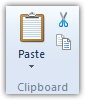
Commands can be used by multiple Ribbon controls. For example, in WordPad, the Paste command is used in multiple places:
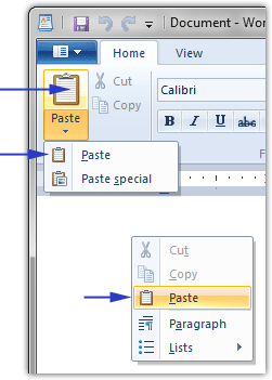
- On the ribbon, when the top part of the big Paste button is clicked.
- On the ribbon, when the bottom part of the big Paste button is clicked, and the Paste menu option is selected.
- On the popup menu that appears when you right-click inside the document.
This allows you to reuse the same command in multiple places. All captions, images and hints are specified at the Command level. You link commands to one or more ribbon controls to make those captions and images appear on the ribbon.
Using the Commands toolbar in the RibbonTools, you can add and remove commands as well as reorder or search them:

You can also use the right-click menu or keyboard shortcuts (Shift+Ctrl+Ins, Ctrl+Del, Ctrl+Up and Ctrl+Down). When you remove a command, and one or more controls use this command, you will get a warning. Removing the command will make those controls unusable.
Each command has the following properties:
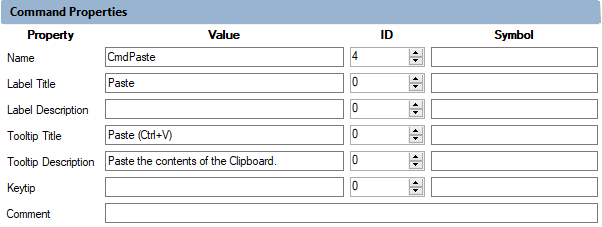
In the picture above, you can see that the “Command Properties” pane is constructed like a DataGridView. There are the header names “Property, Value, ID and Symbol” at the top of each column. For each row on the left there are all properties for the command. Normally we only use the “Value” for the properties. For the property “Name” we also use the ID which is auto generated. The Property “Comment” is used in the *.h file after running the UICC compiler. But it is also used as a Visual Studio IntelliSense information in the generated *.cs or *.vb source file.
-
Name: each command must have a unique name, which must be a valid C# or VB identifier. This name is later used to connect controls to commands. Unless you also specify a Symbol, this name will only used in Header file as constant you will use to access this command. ID: Unique number in the range 2 … 59999. Only necessary for the Name. By adding a new command, the number is auto generated. Symbol: the name of a constant that will be generated for this command. If you do not specify this, the Name property will be used.
-
Label Title: this is the title or caption of the command as it will appear on the ribbon or context popups. You can optionally specify an ID and Symbol for the label title. The ID will be a numeric identifier for the string resource for this caption in the resource file. Similarly, the Symbol will be the name of the constant used for this identifier. For C# or VB applications, you usually don't need to specify these values and you can leave them empty.
-
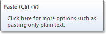
Label Description: a longer description of the command. This description is only used when the command is used in the right side of the application menu:
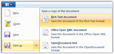
In this example, the Label Title of the highlighted command on the right is "&Rich Text document", and the Description is "Save the document in the Rich Text format.".
!Note:
In the application "RibbonTools" you have to set just a "&" instead of "&" for setting a key shortcut in the Label Title.
- Tooltip Title: the title of the tooltip (hint) that appear when the user hovers the mouse over the command. This title is displayed in bold at the top of the tooltip:
-
Tooltip Description: the description of the tooltip as it appears below the title.
-
Keytip: the keytip or key sequence that is used to access the command using the Alt key. This keytip appears when the user presses the Alt key to navigate the ribbon:

- Comment: this comment is placed in the Header file after the constant for this command. It is also used for a Visual Studio IntelliSense information for the ribbon control which is connected to this command.
You can specify up to 4 sets of images for each command. You can specify images for when the command is displayed in Small or in Large mode (for example, as a Small or a Large button on the ribbon). You can also specify additional images for when Windows is running in High-Contrast mode (again both Small and Large images).
Each image should be a 32-bit BMP image containing an Alpha channel. The Alpha channel is used to make parts of the image partially transparent, for example around the edges or when the image contains a slight shadow. Unfortunately, a lot of image editing applications don't allow you to save images as 32-bit BMP files with Alpha channel. Fortunately, you can use the RibbonTools to load PNG files with Alpha channels. Most image editing applications will support this format. The RibbonTools will automatically convert the image to a 32-bit BMP file.
Every command should have at least one small and one large image (unless the command is only ever displayed in Large or in Small mode, in which case you can omit one of the images). The small image should be 16x16 pixels in size, and the large image should be 32x32 pixels in size. These images are used when Windows is running at the standard screen resolution of 96 dpi (dots per inch). When a user increases the screen resolution in Windows, these images will be scaled up, which can result in blurry edges and lower quality:
96 dpi 144 dpi (150%)
To improve the quality at higher dpi settings, you can specify additional images for each command for different dpi settings. Common dpi settings are 96 dpi (default), 120 dpi (125%), 144 dpi (150%) and 192 dpi (200%). The image sizes for small and large images for these resolutions are:
| DPI | Small Image | Large Image |
|---|---|---|
| 96 dpi | 16x16 pixels | 32x32 pixels |
| 120 dpi | 20x20 pixels | 40x40 pixels |
| 144 dpi | 24x24 pixels | 48x48 pixels |
| 192 dpi | 32x32 pixels | 64x64 pixels |
The WordPad template uses additional images for all these resolutions. As a result, the ribbon images will look better (sharper) in higher resolutions:
144 dpi with scaling 144 dpi with additional images
Important: the ribbon will only show the higher resolution images if your application is High-DPI aware. By default, applications are not DPI aware. To make them DPI aware, you need to modify the application manifest. The easiest way to do this with Visual Studio is like this:
- In your project add an application manifest file.
- In edit mode of the manifest file uncomment the section with the dpiAware tag.
- Now compile and test your application with different DPI resolutions.
- Maybe you can see a bug in WinForms with TableLayoutPanels in higher DPI resolutions, then you cannot use DPI aware. Microsoft is working on a solution.
Now, when you build your project, it will be DPI aware and will look better at higher resolutions.
For more information about image guidelines, see the MSDN documentation.
For each set of images (Small, Large, High-Contrast), the RibbonTools shows the following frame:
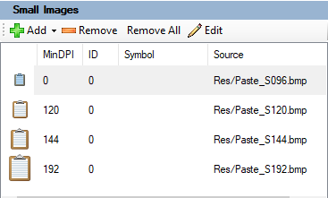
You can add, remove and edit the image properties here. When you add an image, you can specify a BMP or PNG file. These should be 32-bit image files with an Alpha channel. The RibbonTools will automatically convert a PNG file to a 32-bit BMP file. When you open a file that is not located inside your Ribbon project directory, it will be copied to a "Res" subdirectory under the Ribbon project directory.
Each image has the following properties, which you can open by double-clicking the image or clicking the "Edit" button:
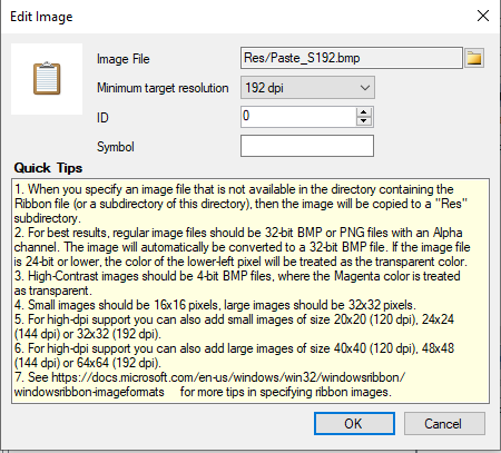
- Image File: the name of the image file, relative to the project directory.
- Minimum target resolution: one of the 4 target resolutions mentioned above, or "auto" for the default resolution.
- ID: an optional ID used to store this image in the resource file. You will usually leave this 0.
- Symbol: the name of the Header constant to generate for this image. You usually don't care about this, so leave it empty.
Specifying multiple images for different resolutions can become a bit tedious. That's why the Add button also has a drop-down menu that lets you add multiple images at once:
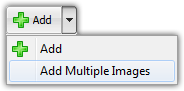
The mouse click will open the File Open dialog box again, but you can select multiple image files now. For Small Images, these should be 16x16, 20x20, 24x24 or 32x32 pixels in size. For Large Images, these should be 32x32, 40x40, 48x48 or 64x64 pixels in size. The RibbonTools will automatically set the "Minimum target resolution" of each image, based on the image dimensions.
We finish this section with some tips:
-
You should create a Command for everything you'll see on the ribbon. This includes:
- Ribbon Tabs.
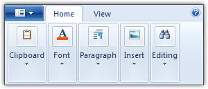
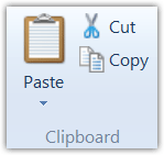
- Ribbon groups (a group of controls like the "Clipboard" group in the pictures above).
- Ribbon controls (buttons, menu items, check boxes, combo boxes, font controls, color pickers etc.).
- The Application Menu.
- The "Recent items" part of the application menu.
- The menu options shown in the application menu.
- The Quick Access Toolbar.
- The Help button at the right of the ribbon.
- Popup and context menu options.
- etc...
-
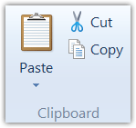
You should also specify small images for ribbon groups. These will be shown when the user reduces the width of the ribbon and the group collapses into a popup: