Using icons
The base-build theme uses a custom implementation of bootstrap icons.
You can add icons using a class on an element. For example, <span class="icon-bi-funnel-fill">filter link</span>.
The classes use display:inline-flex; so they work best to elements within a container.
You can have icons appear before or after an element, with or without an underline on the text. To show an underline, use the class focus-underline.
There are a limited set of icons available. We only generate what we need. You can contribute icons to the base-build making then available to other projects.
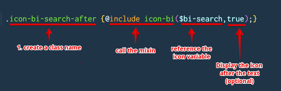
Icons are created by adding a new class that references the icon you want to use. A scss mixin looks after the rest.
Here's an example of an existing icon set:
.icon-bi-bookmark-plus {@include icon-bi($bi-bookmark-plus);}
.icon-bi-bookmark-plus-after {@include icon-bi($bi-bookmark-plus,true);}
In the first example, an argument references the icon we want to use, $bi-bookmark-plus. In the second example, we use an optional second argument that will show the icon after the text.
This assumes you have sass set up in your environment and can compile css.
- edit the /scss/components/_icons.scss file.
- go to the bootstrap icons page and find the icon you want to add.
- copy the class name for the icon (1)

- create your class, it's a good practice to name the class with the icon class included, for examp,e
.icon-bi-my-icon - add the class you copied in step 3 as an argument, make sure to prefix with a
$, this calls the appropriate variable from the bootstrap icon variables file. -
Optional add a
trueargument if you want to show the icon after the text. - save
- compile scss