Inserter: Try showing a "line" between two blocks on hover to insert a new empty block #5198
Conversation
edc4cd9 to
6054dd4
Compare
|
Just looking at the GIF, I love this, and glad to see the sibling inserter return. I think this looks like a good implementation. It may be worth getting this one in quickly, and if it isn't obvious enough, we can fade a plus icon in as well. But given it invokes the in-canvas inserter on a newline (yay for fewer and consistent interfaces), I think this is a good first step to try. Can the gray separator be moved down 2 pixels, so it's perfectly centered between the blocks? Can the gray separator have left and right margins, so it's as wide as the content inside the blocks, not the contents + block padding? With that, 👍 👍 On a personal note — I take full responsibility for removing the sibling inserter as part of the test to see if we could do without it. While I still think it was a valuable test: the results are clear that we can't do without it, given how many eyes are on Gutenberg right now it's definitely sub-optimal to test this in plugin releases, even if we are still in beta. The biggest reason being: unless people read the changelog, they have no good chance to know that it's part of a test and that the UI they relied on might return. It definitely difficult to balance the need to improve UIs and iterate fast, with the need to not alienate testers. Sorry about that, and sorry about the amount of feedback it directed negatively at you specifically. If anything it should've been directed at me. |
|
Love this. Feels natural to click between blocks, I found myself doing this often when wanting to insert at a specific point. |
|
And I wouldn't feel too bad about the feedback, this is still a beta, we have to be free to test things out and sometimes radically change something if it will turn out for the better. In this case, we know something we didn't know before testing all the options :) |
Don't worry too much Joen, I don't mind receiving and replying to feedback. And I was fully behind the decision to remove the inserter for consistency. |
|
Thanks folks, appreciate it. I'm personally okay with receiving a little flak for what in hindsight might have been a little haphazard. I just wish it didn't reflect onto others. Appreciate the support.
I agree — it's also mimicking the pattern you'd employ in a non-block editor. In Google Docs if you want to insert an image between two other images, the natural inclination is to click there and make a linebreak. |
|
Updated with the tweaks. Nothing that if one adjacent block is selected, the line is a bit smaller than the border of the selected block |
|
I think it looks great! Forgot to mention — can we fade in the line much faster? My transition math isn't super great, looking at |
d4b587e to
d0d4115
Compare
|
How this is supposed to work when using only the keyboard? I'd like to remind that any functionality should be device-independent and thus work also with keyboard only. In this discussion I see you're considering only At this point of the development I'd like to see features being designed since the beginning with some basic accessibility level. 🙂 |
For me this is one of the features that shouldn't be used with keyboard because it goes against tabbing between/in blocks and has alternatives with keyboard. So, with accessibility in mind, I added the |
|
Keyboard is just one type of device. There are many others. For this reason I've mentioned "device independence". Many alternative devices and software work in sort of "keyboard emulation" mode. I'd also like to remind the original sibling inserter (the one with the + icon) perfectly worked with keyboard. Not sure why the argumentations seems to have changed now. |
That's just my argumentation, I didn't build the original sibling inserter so I can't speak for it. I'm just asking for actionable items here. What should I do? do you think I should remove the |
|
What Andrea is trying to say is that back when the + button was in there, you could focus it with Tab and press Enter to get a new block. Not being able to focus it now is a regression in that sense. So yeah, removing the tabindex would be sufficient, if I understood correctly. |
|
@youknowriad I'm not even sure why the original inserter with the + icon was changed :) |
|
This looks like a big improvement nice job! My only comment from testing Gutenberg a bunch with clients/friends is a plus icon on hover/select or whatever might be nice in addition so you can directly insert a block rather than first getting the inserter to come up, thus cutting out a click. Hope that makes sense... |
We had this, and it was getting in the way of the writing flow. We need to find a balance between using Gutenberg as an editor (writing flow) and using it as a content builder (adding blocks). That's just my opinion but the current solution seems like a good middle ground approach to avoid several ways of inserting content while not making so hard. |
| '.editor-block-contextual-toolbar': 2, | ||
| '.editor-block-switcher__menu': 2, | ||
| '.components-popover__close': 2, | ||
| '.editor-block-list__block > .editor-block-list__insertion-point':2, |
| return null; | ||
| } | ||
| function BlockInsertionPoint( { showInsertionPoint, showInserter, index, layout, rootUID, ...props } ) { | ||
| const onClick = () => { |
There was a problem hiding this comment.
For a component which is rendered for every block, I think we ought to be conscious of the referential equality of functions in render reconciliation and pre-bind these into a component class.
| function BlockInsertionPoint( { showInsertionPoint, showInserter, index, layout, rootUID, ...props } ) { | ||
| const onClick = () => { | ||
| props.insertDefaultBlock( { layout }, rootUID, index ); | ||
| props.startTyping(); |
There was a problem hiding this comment.
Should startTyping be an effect of insertDefaultBlock?
There was a problem hiding this comment.
While we use it this way in general, I wonder if it makes sense conceptually. A third-party plugin would want to trigger insertDefaultBlock programmatically without impact on the writing flow.
f00cfc9 to
973ad7a
Compare
|
feedback addressed, I'll defer to @jasmussen about the usability feedback from @aduth |
I would think not. The pattern for this iteration of the in-between/sibling inserter, is to mimic that of making a linebreak. As there already exists sort-of-a linebreak at the end of the post, this one shouldn't be necessary.
That would potentially be nice, it seems like? If it feels good in the branch, no reason not to. |
bb48be5 to
d5f9833
Compare
d5f9833 to
c0aad6c
Compare
|
Feedback addressed, waiting for the tests before merging |
| @@ -396,6 +430,21 @@ | |||
| } | |||
| } | |||
|
|
|||
| .editor-block-list__layout > .editor-block-list__insertion-point { | |||
| position: relative; | |||
| margin-top: -15px; | |||
There was a problem hiding this comment.
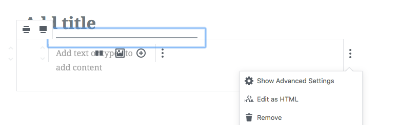
This causes misalignment of the first block, overlapping the title and putting the text caret at the wrong position when clicking within the writing prompt:

The line also extends beyond the correct bounds of the block list / title:

There was a problem hiding this comment.
Also noting that the misalignment impacts nested blocks, and should be accounted for:

(The tops of the squares should align)
|
This is now the default focus target for nested blocks (the bug which occurs when pressing menu). The line itself it doesn't look so great:
|
| @@ -215,6 +216,7 @@ class BlockListLayout extends Component { | |||
|
|
|||
| return ( | |||
| <BlockSelectionClearer className={ classes }> | |||
| { !! blockUIDs.length && <BlockInsertionPoint /> } | |||
There was a problem hiding this comment.
This needed to be passed rootUID. When trying to insert a block before the first block in a Columns block, it appears in the top-level instead.
| <div className="editor-block-list__insertion-point"> | ||
| { showInsertionPoint && <div className="editor-block-list__insertion-point-indicator" /> } | ||
| { showInserter && ( | ||
| <button |
There was a problem hiding this comment.
Anticipating a future bug: Arrowing up or down from a block will focus the between-inserter.
There's no good reason we don't include button in this set:
gutenberg/editor/components/writing-flow/index.js
Lines 76 to 85 in f3c1e22
...Actually, I'm seeing the "good reason", and it's to avoid focus moving into the block toolbar. This is very fragile, as I'd guess if someone did something like add an input (input type="button") into the toolbar, it'd break as-is.
|
As far as I can tell, this just doesn't work at all for nested blocks. I think it's an issue of |
|
This surfaced #5291. |
|
It should be fixed with #5282 |
|
@youknowriad In testing #5291 while on #5282, the issue still persists. Might be something separate. |
|
Right I misread the issue :) I'll take a deeper look tomorrow morning |
|
#5291 has proposed resolution in #5296 |
|
I think you should remove block if clicked between blocks and moved away in work. Beginners tend to click around a lot, and it will result in many, really many, empty blocks. Each click makes new block. Not each click is meant to be a block. Have some feeling all this is unnecessary made complicated. You are haunt by reducing number of clicks. But sometimes it ends in not better things. Clicked quickly around 14 times, and I have 14 empty blocks I do not need. Now it is 28 clicks to remove them all. 19 new (empty) blocks (after saving) for feeling around for literary about 60-120 seconds. Insane and crazy. What are you doing. |
| ), | ||
| showInserter: ! isTyping( state ), |
There was a problem hiding this comment.
I'm looking to enhance the between-inserter and am unclear the intent with this condition. Why do we only render the inserter button while not typing?
There was a problem hiding this comment.
Honestly, I don't remember why I added this exactly :)
Feedback suggests that people care about the in-between blocks inserter.
This inserter had some issues: being too distractive, some issues related to the big click area.
This PR explores an alternative showing a gray line between two blocks on hover and when you click it, you add a new empty block at that position. At that moment you'll be able to insert any other block there.