Block Editor: Fix overflowing LinkControl.
#20154
Conversation
 epiqueras
added
[Type] Bug
epiqueras
added
[Type] Bug
|
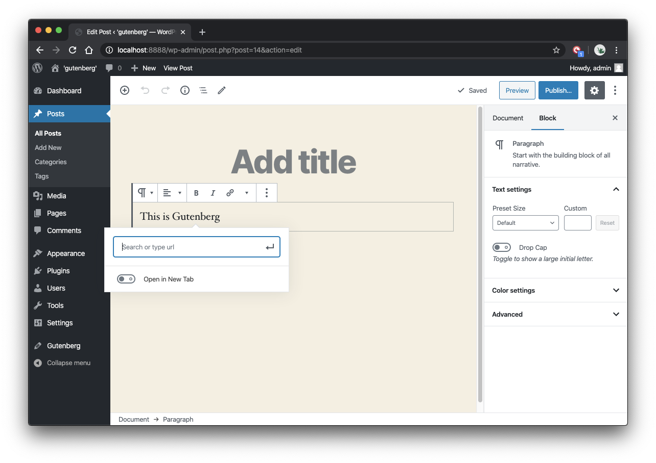
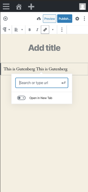
This seems to have the effect of making the input much narrower than it was previously in larger viewports:
Any way we can retain the width? |
 epiqueras
force-pushed
the
fix/overflowing-link-control
branch
from
epiqueras
force-pushed
the
fix/overflowing-link-control
branch
from
451cb8e to
e4a911a
Compare
|
Yes, a media query. Updated! |
|
I think this helps make it less likely to overflow, since the natural width of the popover will be much narrower, but it's still possible for overflow to happen, at least on some smaller devices like iPhone SE.
Conversely, on larger mobile devices, there's a lot of extra space available, and the input feels unnecessarily small.
For me, an ideal solution would be one in which the component maximizes the space available, up to a point. For example: width: 90vw;
max-width: $modal-min-width;The trouble is that the popover implementation is rather naive in how it tries to reposition when space is not available. Currently, it will only ever try to flip the desired position, which means for something which occupies most of the width of the viewport, it's quite likely it's still going to overflow after the flip. I think it would be nice if the popover was implemented to "push itself away" from the edge of the screen instead. There's also another issue here: The width of the suggestions have their own separate width, so the popover can suddenly widen after entering a search term. The widened popover can stretch beyond the viewport, even in larger devices like iPhone X.
I believe the intention is that the popover shouldn't ever resize after it's already visible. At least, this is how it behaves on larger displays in |

|
I think it currently only exists in the G2 UI branches, but perhaps the same method of keeping the block toolbar from going off-screen could be used here. |
 epiqueras
force-pushed
the
fix/overflowing-link-control
branch
from
epiqueras
force-pushed
the
fix/overflowing-link-control
branch
from
e4a911a to
bd256c9
Compare
|
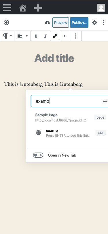
@aduth The latest update should handle those cases better. |
|
For me, that regresses back to what it was in #20146.
Which, from my perspective, would make sense following the change. I could have been clearer, but in my previous comment I meant to imply that it would be ideal if we could express it this way (at least as far as expressing the desired width of the popover), but that the current implementation of popover cannot support this because its implementation of repairing overflow is currently rather naive. |

|
I’m not seeing that with my latest changes. The popover stays at 90vw so it
never overflows.
|
|
It would never overflow if it could be guaranteed to be centered on the screen. It likely depends where horizontally in a line of a paragraph the dialog is opened, since the behavior of that dialog is to open centered at wherever the selection is, which can be (but isn’t always) aligned to the center of the viewport. |
|
Right, but this is still way better than master. We can fix the popover
later.
|
|
It's slightly better, in that the natural width will be slightly narrower on smaller viewports ( I would be okay to merge it as an improvement, but I'd not mark it as fixing #20146. |
|
Yeah, there are still edge cases because of the popover flip. I've updated the description. This PR is still needed even if we fix the popover. |
|
I might wonder if this would negatively impact the reusability of this component. Specifically thinking about #18061. |
|
Good points. I've scoped the styles. |
Co-Authored-By: Andrew Duthie <andrew@andrewduthie.com>
| text-overflow: ellipsis; | ||
| max-width: 230px; | ||
| overflow: hidden; | ||
| white-space: nowrap; |
There was a problem hiding this comment.
The three styles text-overflow, overflow, and white-space are pretty directly linked, if I understand it correctly. I would expect that either all should be removed, or all should remain.
What was the purpose for removing white-space? As best I can tell, in combination with the other styles, it would not been the case that the element would stretch, and instead it would be truncated.

Contrast that with how it behaves after these changes:

I think either could work, but it seems like the behavior of the former was likely a conscious design decision to keep the heights of these suggestions consistent (cc @getdave).
I'd guess this might have been related to my comment at #20154 (comment) ? It feels to me we shouldn't want there to be an explicitly assigned max-width here, at least not one with a fixed pixel value. I'd guess this also hurts reusability of the component, since it seems pretty focused on it being rendered in the popover.
There was a problem hiding this comment.
I removed it because the header still stretches up to 230px with it.
There was a problem hiding this comment.
Yes it was deliberate to ensure consistent height
Sorry i dont get these pings. I need better GH skills!
There was a problem hiding this comment.
It's not working for me in Chrome. The content is cut off without an ellipsis.
| @@ -3,6 +3,12 @@ $block-editor-link-control-number-of-actions: 1; | |||
| .block-editor-link-control { | |||
| position: relative; | |||
| min-width: $modal-min-width; | |||
|
|
|||
| .components-popover__content & { | |||
There was a problem hiding this comment.
Why the LinkControl should be aware that. it can be used in a Popover?
There was a problem hiding this comment.
Are you saying the parent component should apply a custom class name?
There was a problem hiding this comment.
I don't know but it feels like:
- The LinkControl shouldn't be aware of a Popover and should behave properly no matter where it's rendered (fluid maybe)
- The Popover shouldn't be aware of its children of course but has smart logic to adapt to the viewport.
Now, I don't know the details of this issue to argue exactly what the fix should be.
There was a problem hiding this comment.
The LinkControl shouldn't be aware of a Popover and should behave properly no matter where it's rendered (fluid maybe)
Agreed, this PR furthers that.
The Popover shouldn't be aware of its children of course but has smart logic to adapt to the viewport.
This requires a bigger refactor of popovers.
There was a problem hiding this comment.
Agreed, this PR furthers that.
It doesn't seem like it since there's an explicit mention of popover in the link control style.
This requires a bigger refactor of popovers.
The popover should already have the logic to adapt the width to the viewport built-in. Maybe there's a bug there.
There was a problem hiding this comment.
It doesn't seem like it since there's an explicit mention of popover in the link control style.
Which is used to remove pixel-based dimension constraints.
The popover should already have the logic to adapt the width to the viewport built-in. Maybe there's a bug there.
Yeah, that logic is not very robust and it overflows the screen in most cases.
There was a problem hiding this comment.
Which is used to remove pixel-based dimension constraints.
Yes, this is cool but can't we do it consistently without any mention of the popover class. I'm thinking the LinkControl can also be shown in narrow contexts independent of the Popover being present or not.
There was a problem hiding this comment.
No, because the way we can dampen the effect of the popover bug here does not necessarily work in other narrow contexts. We can only assume a 90vw is OK because the popover renders on top of everything.
There was a problem hiding this comment.
Do you think a generic solution based on "react-resize-aware" would work here like the Placeholder component?
There was a problem hiding this comment.
Yes, or react-spring/react-use-measure.
|
@aduth This is still an improvement over master, right? Can we merge this and fix the Popover issue separately? |
|
Why don't we try to fix the issue once and for all by making the component responsive? |
|
See #20154 (comment). |
|
I'm merging this PR as it seems a simple enhancement that can be included in WordPress 5.4. As a follow up I guess we can use a "react-resize-aware" or react-use-measure based approach. |
|
With regards to the discussion here about the tooltip's overflow mechanics, I think it might be worth considering to pull in Popper to replace our implementation. I've been a bit resistant to it when brought up previously, in part because our custom implementation has been mostly sufficient for our purposes, and we don't need all of what the library brings with it (i.e. avoid inflating bundle size). Notably, it does quite well in this regards of "pushing away" from the bounds of a container:
https://popper.js.org/docs/v2/modifiers/arrow/ There are two other things to follow-up on here:
Issue: #20446 |
|
Yes, I also think this is a place for a third party library. |
|
I've used Popper in a personal project. I think it's great but it won't replace our Popover entirely, it's something we can use to remove some custom logic from Popover and use it as a low-level abstraction. We also have very custom behaviors (toolbar moving when it hits the edge of the editor canvas) that will most likely need to be implemented as "custom modifiers" for Popper. |
Improves #20146.