Polish datetime popover. #18235
Polish datetime popover. #18235
Conversation
There was a problem hiding this comment.
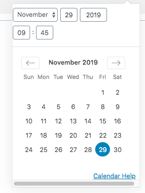
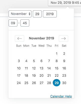
Hi @jasmussen, on the publish sidebar where the component is not used in a popover, there is a small visual change.
Before:

After:

I just wanted to confirm if that change is ok, or if we should add a rule to avoid that change.
|
No, good catch, let me see if I can fix that one. |
|
Fixed, thanks. |
| @@ -5,6 +5,8 @@ | |||
| /*rtl:end:ignore*/ | |||
|
|
|||
| .components-datetime { | |||
| padding: $grid-size; | |||
There was a problem hiding this comment.
Is this needed for all datetime components even outside the modal context? I feel this is specific to the editor usage.
There was a problem hiding this comment.
You are right. This component that is included is horrendously messy with arbitrary inline styles. It needs a fresh approach, so I've committed some work in progress and will try a separate PR that goes at it differently.


┻━┻ ︵ヽ(`Д´)ノ︵ ┻━┻o
There was a problem hiding this comment.
But it is a good question, though, should it come with a padding or not?
The original version of this PR suggested that yes, this component should be born with padding, and if you need the component inline, as in the post-publish, you should override it there. Because otherwise you use the vanilla Popover component with the vanilla DateTime component, and you get this:
I can remove some negative margins to fix the horizontal scrollbar:
But the question becomes, if the datetime component should not have padding, should the popover?
I'm going to try something different, but this is context for why I added the padding.
There was a problem hiding this comment.
What's causing the horizontal scrollbar in the first place is this:

And it is virtually impossible to refactor that width away because the entire datetime component referenced is reliant on this.
1ea11a7 to
36a0ee7
Compare
|
Thank you, Riad, for the review in #18235 (review). As you can see from the ensuing discussion I tried my best to work outside the baked in padding. However I failed to do so, and I see no way of fixing this issue without throwing out the calendar 3rd party library entirely and picking a different one. It's just not that good and has so many hardcoded inline styles that are necessary for it to function. The good news is, I've applied a bunch of polish to this PR:
Same-height inputs, more cohesive padding and spacing. It looks way better, and it fixes the issue. The only price is, when you mean to use the datetime component inline, as in the postpublish dialog, you have to unset the left and right paddings. I think that's a small price to pay to move forward, without a total refactor. Let me know what you think. I've rebased and squashed this nicely so it should be easy to re-review. |
|
To be fair, I still don't get it. Why instead of overriding the padding for non-popover usage, do the opposite. No padding built-in and override the styles for the popover case only (which is the special case for me) |
Fair pushback, I suppose I didn't fully explain why I prefer this. It has to do with the following:
The date component adds a horizontal scrollbar if the popover is smaller than 255px + 2x13px added further up that hierarchy. The min-width for popovers is 260px, defined elsewhere. Which leaves us two ways to avoid a horizontal scrollbar when used outside of the sidebar:
I can't stress how ugly the code for the date time library is — you kind of have to inspect it to understand why. I mean a third option is to add additional CSS classes or wrappers for any third party that means to use the component inside the popover, and set that class to 280px width. But it's hack upon hack. |
|
I've used this branch and applied this commit 53d2a09 to invert the application of the padding. I'm trying to understand what breaks? |
This happens:
That is how the date-time component looks if you don't apply the following CSS: In other words, if the date time component is used in a popover outside of Sure, that's an option — but it feels like it optimizes the date time component to be used inline, vs. used in a popover, and I would suggest the latter is far more likely. |

|
I may be missing something obvious, if that's the case I do apologize. I was up at 5am this morning. |
|
Ok, I understand better, sorry for the back and forth. I think all components in That said, I checked deeper and yeah, the issue is the negative margins. I think we can probably remove them and find a way to remove the big padding that calendar has but I'm fine with this PR making an exception to the rule above. |
The popover inherited a min-width of 260, which is insufficient, then overrode it just for the edit-post-schedule flow. This means the datetime component looks fine in the sidebar, but no-where else.

This PR changes the base inherited minwidth to 270, so the component can be used outside of the sidebar.
The DateTime component as it exists, references a 3rd party library that uses lots of inline styles and hard-coded widths and dimensions.

Having explored various other approaches now, there are only two ways to fix this.

1. Actually add the padding to the component itself. This is the only way to make it work inside popovers when used outside of WordPress.
2. Do a major refactor to include a different datetime library.

In order to move forward, I'm therefore embracing the padding.
36a0ee7 to
dccda57
Compare
|
Rebased to see if that makes the checks pass. Thanks so much for the reviews, Riad. Every question you've asked is right, and honestly I wanted to address them. But the way the datetime component is built, it really deserves a bigger refactor to make this all possible. The problem with those negative margins is that it's a horizontally sliding calendar sheet that's built in a roundabout way. If we tinker with the margin, this sliding effect breaks when you press "next", which means the styles that are set inline need to be overridden also, and at some point we've reimplemented the whole thing in overriding CSS 😭 — it's a castle made of sand. But I do believe there is a ticket to revisit the datetime component entirely, that will be a good opportunity to make this better. |
The popover inherited a min-width of 260, which is insufficient, then overrode it just for the edit-post-schedule flow. This means the datetime component looks fine in the sidebar, but no-where else.
This PR changes to use a padding in the component itself, making it work everywhere.
Example of component used outside of sidebar, before:
After: