Skip to content
New issue

Have a question about this project? Sign up for a free GitHub account to open an issue and contact its maintainers and the community.

By clicking “Sign up for GitHub”, you agree to our terms of service and privacy statement. We’ll occasionally send you account related emails.

Already on GitHub? Sign in to your account

Fix styling of classic block's block controls #17323

Merged
merged 8 commits into from
Sep 6, 2019

Conversation

talldan
Copy link
Contributor

@talldan talldan commented Sep 4, 2019

Fixes #16525
Fixes #16137
Fixes #12104

Description

This PR fixes a few issues with the classic block's styling that seem to have recently broken.

Screenshots

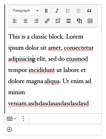
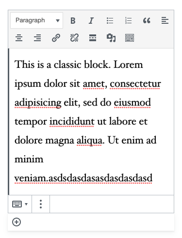
Fixes the positioning of the block controls toolbar

Before

(the introduction of the group transform for the classic block has made its block controls hang over the edge)
Screen Shot 2019-09-04 at 4 24 41 pm

After

(the block controls are now in line with other blocks)
Screen Shot 2019-09-05 at 1 02 55 pm

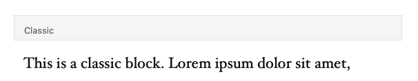
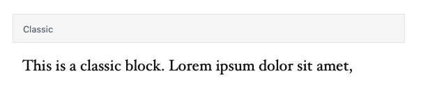
Fixes a stray border that displays on the classic block when it's unselected

Before

Screen Shot 2019-09-05 at 1 02 08 pm

After

Screen Shot 2019-09-05 at 1 07 33 pm

Fixes that classic toolbar is displayed when the block is unselected

Before

Screen Shot 2019-09-05 at 1 01 57 pm

After

Screen Shot 2019-09-05 at 1 10 14 pm

Fixes that the classic block shows as selected when a parent block is selected

Before

Screen Shot 2019-09-05 at 1 12 56 pm

After

Screen Shot 2019-09-05 at 1 13 16 pm

Types of changes

Bug fix (non-breaking change which fixes an issue)

Checklist:

  • My code is tested.
  • My code follows the WordPress code style.
  • My code follows the accessibility standards.
  • My code has proper inline documentation.
  • I've included developer documentation if appropriate.

@talldan talldan added [Type] Bug An existing feature does not function as intended [Block] Classic Affects the Classic Editor Block labels Sep 4, 2019
@talldan talldan self-assigned this Sep 4, 2019
@talldan talldan requested a review from kjellr September 4, 2019 08:31
@talldan
Copy link
Contributor Author

talldan commented Sep 4, 2019

I was mostly interested in fixing this bug very quickly, but I suppose it would also be possible to bring the classic block's toolbar more inline with other blocks:

Screen Shot 2019-09-04 at 4 57 03 pm

edit - I'm now thinking this might be the better option given what's described in #12104 and #16137. This option would work better when zooming and also won't break if the transform is removed.

@talldan talldan added the Needs Design Feedback Needs general design feedback. label Sep 4, 2019
@kjellr
Copy link
Contributor

kjellr commented Sep 4, 2019

Thanks, @talldan. This must've popped up when the group block landed? I don't recall the classic block having a block switcher control in the first place. I think both of those controls were intended to be tucked inside of the block like so:

Screen Shot 2019-09-04 at 8 19 14 AM

... but that creates a weird line break in the first row of controls. In any case, I think your proposed toolbar makes a lot of sense here. I think that's the better route.

@mapk
Copy link
Contributor

mapk commented Sep 4, 2019

Thanks for picking this one up, @talldan. I like the proposed solution of aligning the elements to match the other block toolbars. That one's a win! #17323 (comment)

@mapk mapk removed the Needs Design Feedback Needs general design feedback. label Sep 4, 2019
@ZebulanStanphill
Copy link
Member

I was confused by the Classic block's block switcher being on the right rather than the left, so I also like the proposal to move it and the ellipsis menu to the same spot as every other block.

@talldan talldan force-pushed the fix/classic-block-styling branch from 6f0ea69 to c42a722 Compare September 5, 2019 05:03
@talldan talldan force-pushed the fix/classic-block-styling branch from 2e5884f to 7026ee9 Compare September 5, 2019 05:27
@talldan
Copy link
Contributor Author

talldan commented Sep 5, 2019

Thanks for the feedback. I've applied that recommendation and fixed a bunch of other issues at the same time. This should be good for a review.

talldan and others added 2 commits September 5, 2019 15:35
- TinyMCE toolbar width on mobile.
- Remvoe box shadow to match other UI.
- Correct height of deselected toolbar label.
@kjellr
Copy link
Contributor

kjellr commented Sep 5, 2019

Thanks Dan. I pushed up a couple tiny additional fixes while we're in here:

1. Corrected the initial toolbar label height:

Before
Screen Shot 2019-09-05 at 9 38 08 AM

After
Screen Shot 2019-09-05 at 9 37 48 AM

2. Corrected the TinyMCE toolbar width on mobile:

Before

Screen Shot 2019-09-05 at 9 48 29 AM

After

Screen Shot 2019-09-05 at 9 44 41 AM

3. I also removed the drop shadow underneath the toolbar.

This is admittedly more of a personal preference, but we don't really use shadows like that anywhere, so I think this seems more natural.

Before

Screen Shot 2019-09-05 at 9 51 28 AM

After

Screen Shot 2019-09-05 at 9 51 46 AM

Copy link
Contributor

@kjellr kjellr left a comment

Choose a reason for hiding this comment

The reason will be displayed to describe this comment to others. Learn more.

This is looking good, and should be ready to land. 👍

@talldan
Copy link
Contributor Author

talldan commented Sep 6, 2019

Thanks folks!

@talldan talldan merged commit fb910e5 into master Sep 6, 2019
@talldan talldan deleted the fix/classic-block-styling branch September 6, 2019 00:36
@youknowriad youknowriad added this to the Gutenberg 6.5 milestone Sep 14, 2019
Sign up for free to join this conversation on GitHub. Already have an account? Sign in to comment
Labels
[Block] Classic Affects the Classic Editor Block [Type] Bug An existing feature does not function as intended
Projects
None yet
5 participants