CSS基础测试22期 #76
Comments
.container {
  text-align: justify;
  text-align-last: center;
}

.item {
  display: inline-block;
  width: 100px;
  height: 120px;
  background-color: #00bfff;
}<div class="container">
<div class="item"></div>
<div class="item"></div>
<div class="item"></div>
<div class="item"></div>
<div class="item"></div>
<div class="item"></div>
<div class="item"></div>
<div class="item"></div>
<div class="item"></div>
<div class="item"></div>
<div class="item"></div>
</div> |
ul {
  padding: 0;
  display: flex;
  flex-wrap: wrap;
  width: 500px;
  justify-content: center;
}

li {
  list-style: none;
  width: 100px;
  height: 150px;
  margin-top: 20px;
  margin-right: 20px;
  background: skyblue;
}<ul>
<li></li>
<li></li>
<li></li>
<li></li>
<li></li>
<li></li>
<li></li>
</ul> |
ul,li {
  list-style-type: none;
}

ul {
  padding: 0;
  display: flex;
  justify-content: center; /* 居中 */
  flex-wrap: wrap; /* 可换行 */
}

li {
  margin: 10px;
  height: 120px;
  width: 100px;
  background-color: #02bfff;
}
<!DOCTYPE html>
<html>
<head>
<meta charset="utf-8">
<meta name="viewport" content="width=device-width">
<title>JS Bin</title>
</head>
<body>
<ul>
<li>1</li>
<li>2</li>
<li>3</li>
<li>4</li>
<li>5</li>
<li>6</li>
<li>7</li>
</ul>
</body>
</html> |
|
liyongleihf2006 和 livetune 都是正解。 |
|
在线demo: JSBIN .demo{
list-style:none;
}
.demo, .item{
margin:0;
padding:0
}
.item{
width: 90px;
height: 120px;
background-color:blue;
margin:4px;
}
/* display: inline-block */
.demo-dib{
font-size:0;
text-align:center;
}
.demo-dib .item{
display:inline-block;
vertical-align: top;
}
/* display: flex */
.demo-flex{
display: flex;
justify-content: center;
flex-wrap: wrap;
}<h2>inline-lock</h2>
<ul class="demo demo-dib">
<li class="item"></li>
<li class="item"></li>
<li class="item"></li>
<li class="item"></li>
<li class="item"></li>
<li class="item"></li>
<li class="item"></li>
</ul>
<h2>flex</h2>
<ul class="demo demo-flex">
<li class="item"></li>
<li class="item"></li>
<li class="item"></li>
<li class="item"></li>
<li class="item"></li>
<li class="item"></li>
<li class="item"></li>
</ul> |
可能最后一行的缝隙间距和前面几行的会出现不一致的问题 |
Sign up for free
to join this conversation on GitHub.
Already have an account?
Sign in to comment
实现下图所示的布局效果,最后一行列表元素居中,其他行两端对齐:
原图地址
如果列表是7项:
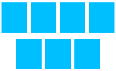
原图地址
本题需要在线demo,同时附上对应的CSS代码即可,可以使用下面语法进行高亮:
本期小测无直播答疑,如果有精彩的实现会拿出来点评。
感谢您的参与!
The text was updated successfully, but these errors were encountered: